

SEO and UX go hand-in-hand, both aiming to ensure users quickly find the website and its content while providing a good page experience.
One without the other can lead to an over-optimized website that feels clunky and unorganized, or an aesthetic, easily scrollable website that’s nowhere to be found on the SERPs (search engine results pages).
Striking a balance between SEO and UX requires a deep understanding of these terms, Google’s latest updates, and some best practices you can implement right away.
- What are UX and SEO?
- How does user experience affect SEO?
- 8 UX factors that impact SEO
- How to measure UX for SEO
What are UX and SEO?
UX (user experience) are the thoughts and feelings a user has when interacting with your website.
If users find the information they seek easily, in a logical order, without interruptions or slowdowns, they’ll have a positive experience and potentially take further steps like browsing your website or purchasing a product.
If the user’s page loads slowly, they’re interrupted by intrusive ads while reading, and spend time without satisfying their intent, the user will have a negative experience and leave your website.
SEO (search engine optimization) is a process of improving a website’s position (rank) in SERP. Without a higher position on a relevant SERP, the user won’t likely find your webpages, therefore they won’t be able to interact with it.
If you appear at the top of the SERPs, it means your webpage is optimized for the keyword and that search intent, therefore relevant seekers will most likely click on your webpage, and vice versa.
How does user experience affect SEO?
User experience impacts SEO in two main ways – ranking & organic traffic and conversions. Here is how and why:
a) Rankings and organic traffic
In 2020, Google rolled out the “Page Experience Update” consisting of two factors:
- Core Web Vitals
- Page experience rankings
This update strengthened the claim that Google not only cares about optimization but also how users interact with your website.
We will share more details about these factors in the “8 factors that impact SEO” section. Here, let’s focus on the impact user experience has on rankings and organic traffic.
Google ranks your webpage based on the search intent and its crawlers. However, it puts your webpage to the test and “measures” how users interact with it.
Spending more time on a website, exploring different pages, and engaging with on-page elements signals to Google that the users are having a good experience.
This either boosts or strengthens your position on the SERP as Google receives another “thumbs up” or lowers your position and authority if users abruptly leave and look at another search result.
Therefore, consider UX as a factor when rankings and organic traffic are your end goal since Google boosts webpages with good UI, consequently opening the door to more traffic.
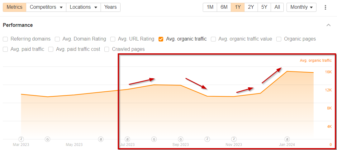
SEO Leverage’s case study shows a clear effect of UX changes on organic traffic. After implementing UX optimization – simplifying the main menu, making buttons clickable, and ensuring format consistency throughout pages.
b) Conversion rates
If a user is having a bad experience with your website, why would they go the extra mile and buy a product or service?
Most likely, they will abandon your webpage and go to a competitor’s, which negatively affects your conversion rate.
Great UX should make the buyer journey simple and smooth so that at every stage, your visitor can either get more information or make a purchase.
Convertica achieved a 12.7% increase in revenue per visitor by decreasing the number of steps to get to the checkout while adding links for FAQs.
8 UX factors that impact SEO
1. Page speed
Page speed refers to how quickly content on a webpage loads, from the moment a user requests the URL to the moment the page is fully rendered in their browser.
In 2018, Google announced “The Speed Update”, which states that page speed will be a ranking factor for mobile users since pages that load slowly affect the user experience severely.
Now, page speed doesn’t only impact your ranking and user experience, but it can prevent you from being indexed at all due to the latest mobile-first indexing update.
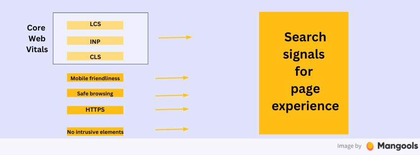
The main metrics Google uses are Core Web Vitals:
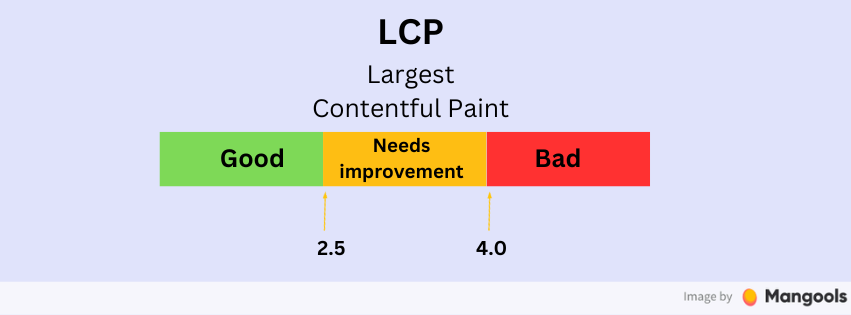
- Largest Contentful Paint (LCP): LCP measures how quickly your website content loads. Strive to 2.5 seconds or less for all web pages, so users don’t get the impression that your webpage will never load.
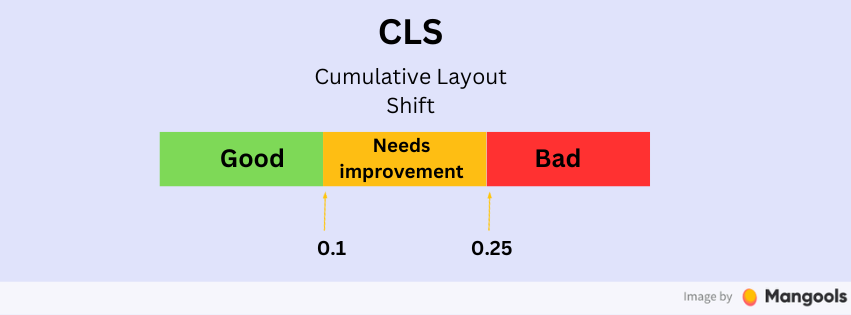
- Cumulative Layout Shift (CLS): CLS analyzes the stability of your website layout. It measures if objects or text on the page will shift suddenly as a user tries to interact with them. Sudden shifts interfere with the user experience, so it should be less than 0.1.
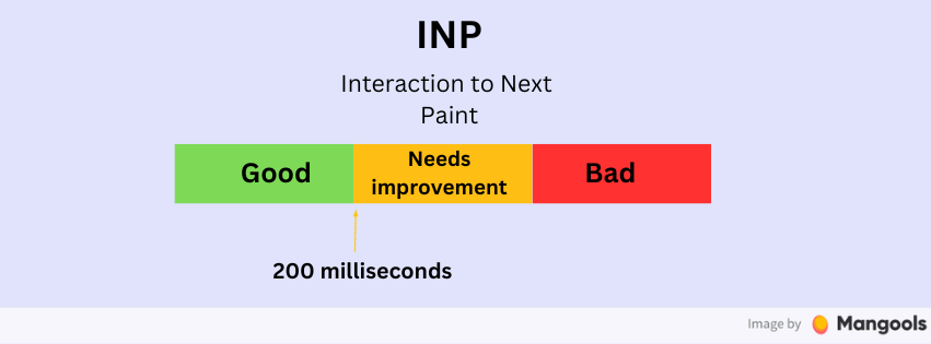
- Interaction to Next Paint (INP): INP measures your page’s responsiveness to a user’s request or action. If your page is unresponsive or has a slow response time (more than 200 milliseconds), it can lead to frustration.
Walmart Canada improved their mobile user experience by decreasing page load times by 36%, and the result was a 98% increase in mobile orders.
How can you improve the page speed of your website?
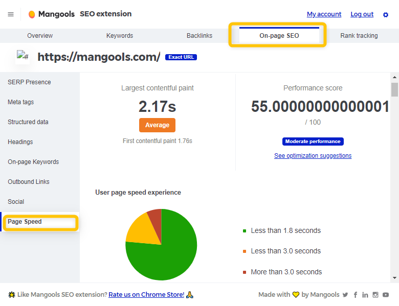
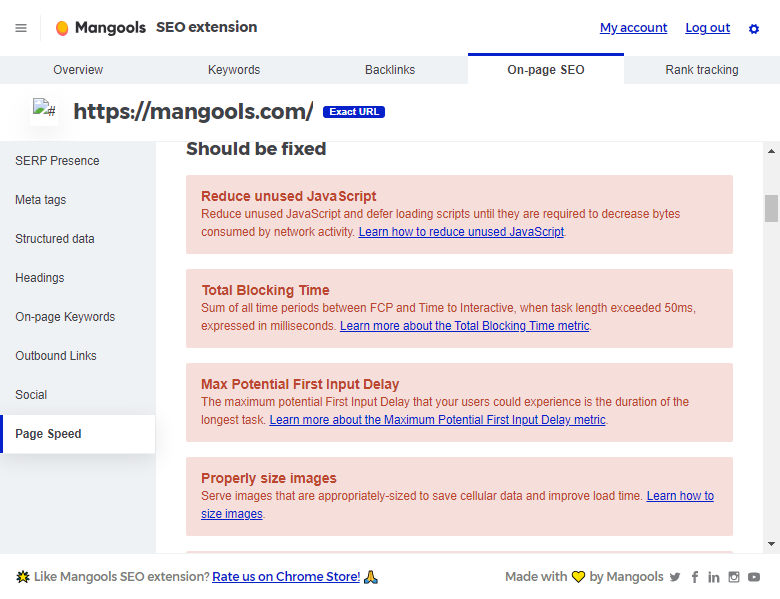
1. Check the speed of every webpage with our SEO browser extension.
2. Click the “On-page SEO” tab and then “Page Speed” on the left menu.
You will get an overview of your LCP, performance score, user page speed experience, as well as a list of critical issues that should be fixed, with detailed instructions.
Overall, you should follow these best practices:
- Optimize images: Compress images and use modern formats like WebP.
- Minimize HTTP requests: Combine files where possible (e.g., merge multiple CSS files).
- Enable browser caching: Set expiry dates for certain file types.
- Use a Content Delivery Network (CDN): Distribute your content across multiple, geographically diverse servers.
- Minify CSS, JavaScript, and HTML: Remove unnecessary characters from code.
- Reduce server response time: Optimize your server, use a faster hosting solution, or upgrade your hosting plan.
- Implement lazy loading: Load images and videos only when they’re about to enter the viewport.
- Optimize CSS delivery: Inline critical CSS and defer non-critical CSS.
- Prioritize visible content: Ensure the content above the fold loads first.
- Use asynchronous loading for CSS and JavaScript files when possible.
2. Mobile-friendliness
Mobile-friendliness describes a website’s performance on mobile devices, which now take priority over desktops due to their widespread preference among users.
A mobile-friendly website should display and function properly on smaller screens, like smartphones and tablets.
Google’s mobile-first indexing update significantly emphasized the importance of responsive design for SEO since Google now predominantly uses the mobile version of the content for indexing and ranking.
Therefore, if you want to get indexed and rank higher while providing a good experience for your mobile users, focus on your mobile friendliness.
Here is how to improve your website’s mobile-friendliness:
- Create a mobile-friendly site (responsive design recommended)
- Make sure Google can access and render your mobile content
- Synchronize robot’s meta tags on mobile and desktop
- Make sure content is equivalent on desktop and mobile
- Check and maintain structured data on both versions
- Use the same metadata (title, description) on both versions
- Follow Better Ads Standard for mobile ad placement
- Provide high-quality images with proper alt text
- Use supported formats for images and videos
- Avoid using URLs that change every time the page loads
3. Content quality
Content quality refers to the overall value, relevance, and usefulness of the information presented on a webpage. High-quality content is accurate, comprehensive, well-written, and addresses the needs and intent of the user.
Google announced the helpful content update, revealing that it gathers signals from your content to determine the relevancy and accuracy of your content and rank your website accordingly.
Up until now, Google doesn’t have anything against AI content per se, but they emphasize E-E-A-T principles (Experience, Expertise, Authoritativeness, Trustworthiness) to ensure original and high-quality content.
A great way to include EEAT in your content is by having author bylines & pages and unique case studies and statistics. For author bylines and pages, make sure to include:
- An author schema markup on the article page
- A linkable list of articles written by the same author
- Online profiles of the author
- Short biography, photos, and any titles
- A credentials schema with all the certificates and credentials (if applicable)
To keep your quality on point, make sure to:
- Prioritize people-first content over search engine optimization
- Provide original, insightful, and comprehensive information
- Implement E-E-A-T principles
- Avoid manipulative SEO tactics, such as keyword stuffing
- Regularly update and maintain content quality
- Use SEO best practices to support, not replace, valuable content
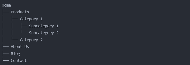
4. Website architecture and navigation
Website architecture and navigation refer to the overall structure of a website, how its pages are organized and linked together, and the systems that allow users to move around the site.
This includes the site’s hierarchy, URL structure, internal hyperlinks, menus, search bars, and other navigational elements. Google’s documentation calls it making your site crawler-friendly, but it is equally important for users to find what they need on your website easily.
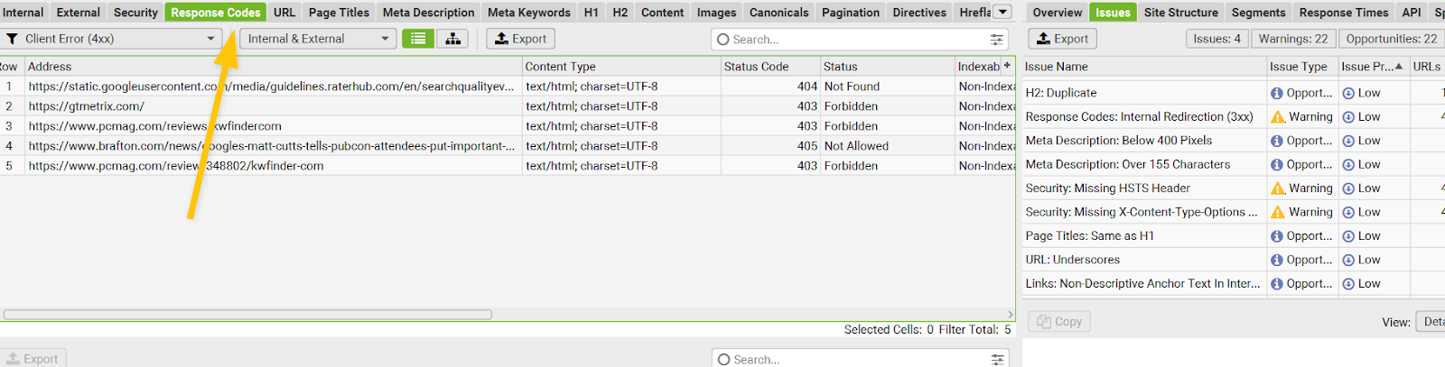
Tip: Use Screaming Frog to check whether the navigation is clear on the website, and nothing is broken or has crawling errors. Input your website in the SEO Spider tool, crawl your website, click on the “Response Codes” tab, and filter “Client Errors” or check the “Issues” tab on the right.
Effective website architecture and navigation are crucial for SEO because they:
- Help search engines crawl and index your site more efficiently
- Improve user experience, which is a significant ranking factor
- Distribute link equity (PageRank) throughout your site
- Reduce bounce rates and increase time on site
- Help search engines understand the relationships between pages and content
Tips for improvement:
- Keep your site structure as flat as possible, with pages no more than 3-4 clicks from the homepage
- Use descriptive, keyword-rich URLs that reflect your site structure
- Implement breadcrumbs to help users and search engines understand page hierarchy
- Create a clear, logical menu structure with descriptive labels
- Use internal linking to connect related content
- Include a search function for larger sites
- Use footer navigation to link to important pages
- Create an HTML sitemap for users and an XML sitemap for search engines
- Use schema markup to help search engines understand your site structure
- Fix any broken links or orphaned pages
- Implement faceted navigation for e-commerce sites with large product catalogs
5. UI and aesthetics
User Interface (UI) refers to the visual elements and interactive components of a website that users engage with.
This includes buttons, forms, navigation menus, and other interactive elements.
Aesthetics, in the context of web design, refers to the overall visual appeal and style of a website, including color schemes, typography, imagery, and layout.
As Google considers user experience to be a ranking factor, a well-designed UI and appealing aesthetics contribute to a positive user experience.
Attractive UI and aesthetics can increase time on site, reduce bounce rates, and improve click-through rates – all of which are signals Google uses to assess content quality.
Here are some tips:
- Implement a clean, uncluttered design that guides users to important content and actions
- Add a table of contents, so users can skim through
- Add FAQs with a schema markup under your listing
- Use rotating footer article links
- Add “content highlights” to demonstrate the key points
- Choose a color scheme that aligns with your brand and enhances readability
- Use whitespace effectively to improve content scannability
- Use legible fonts and appropriate font sizes to improve readability
- Ensure sufficient color contrast for better accessibility
- Use consistent design elements throughout the site to reinforce brand identity
- Implement micro-interactions and subtle animations to enhance user engagement (but be cautious not to overdo it and affect performance)
- Regularly A/B test different design elements to optimize for user engagement
- Ensure that your UI elements are easily clickable/tappable on mobile devices
- Consider using card-based design for content-heavy pages to improve organization and scannability
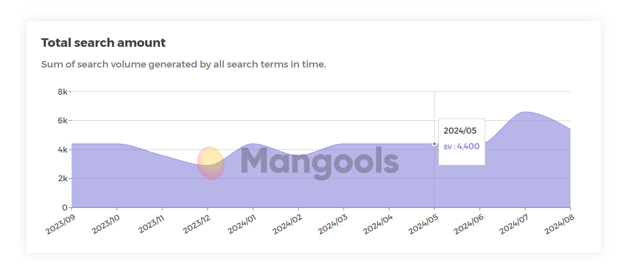
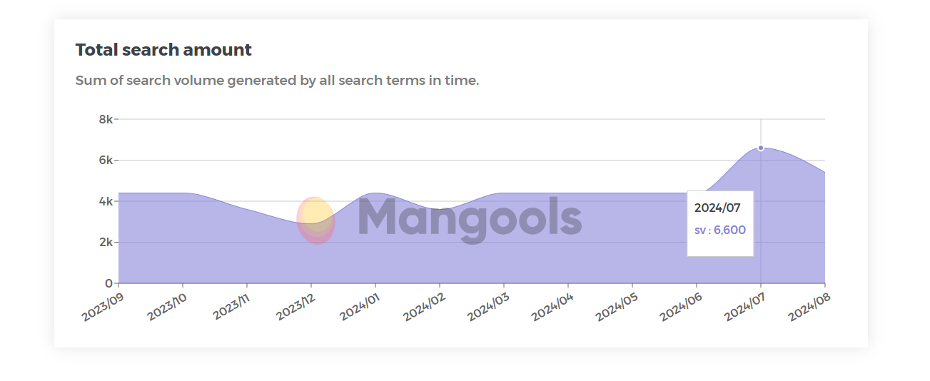
To demonstrate how design and UI can boost the amount of branded searches, we used our free Share of Search tool to check the amount of branded searches before & after the change of UI and design for the website “Discover Ireland.”
Before:
After:
“We employed the “less is better” philosophy in the re-design of this project. The layout is fully responsive with a carefully thought-out minimalist design. Each UI element is part of a design system that ensures visual consistency across the design of the site. Each UI component is useful, functional and beautiful in its simplicity.” says the team at All Human in their “How design impacts a brand’s digital performance” case study.
6. Web accessibility
Website accessibility refers to the practice of designing and developing websites so that people with disabilities can use them effectively.
Google hasn’t published any documentation saying strictly that accessibility affects SEO, however, accessibility directly impacts the user experience.
If people with auditory, monitor, or visual experiments can’t fully engage with your content, they will have a poor UI and will end up abandoning your website.
Here is how to make your website more accessible:
- Provide text alternatives for images
- Ensure proper color contrast
- Make sites keyboard-navigable
- Use semantic HTML for proper structure
- Provide captions and transcripts for audio/video content
- Create responsive designs that work on various devices and screen sizes
7. Intrusive ads
Intrusive ads significantly disrupt the user’s ability to access and interact with the main content of a webpage. These can include pop-ups that cover the main content, autoplay videos with sound, large sticky ads, etc.
Intrusive ads affect both the user experience, page speed, and mobile friendliness and can lead to higher bounce rates – which makes them an “enemy” of SEO principles.
If you have ads or pop-ups on your website, here is how to optimize them:
- Follow Better Ads Standards
- Use responsive ad designs
- Avoid autoplay with sound
- Limit the number of ads
- Consider ad timing
- Make ads easily dismissible
- Use asynchronous ad loading
8. HTTPS security
HTTPS (Hypertext Transfer Protocol Secure) is the secure version of HTTP, the protocol over which data is sent between a browser and the website it’s connected to. HTTPS encrypts this data, providing three key layers of protection: encryption, data integrity, and authentication.
Google has started to move towards a more secure web with its Secure Web update, flagging and decreasing the rankings of not-secure websites.
Here are some tips to make your web pages secure:
- Obtain an SSL/TLS Certificate: Purchase or obtain a free certificate from a trusted Certificate Authority (CA).
- Install the certificate: Properly install the SSL/TLS certificate on your web server.
- Update internal links: Change all internal links from HTTP to HTTPS.
- Implement HSTS: Use HTTP Strict Transport Security to ensure browsers always use HTTPS to access your site.
- Set up 301 redirects: Redirect all HTTP traffic to HTTPS using 301 (permanent) redirects.
- Update canonical tags: If you use canonical tags, update them to point to HTTPS URLs.
- Monitor security headers: Implement and regularly check security headers like Content-Security-Policy, X-XSS-Protection, and X-Frame-Options.
How to measure UX for SEO?
Here are four tools you can use to easily measure UX for SEO and see where your website stands:
Google Search Console
Google Search Console provides reports based on data collected from the Chrome User Experience Report (CrUX). Here’s how you can use Google Search Console to get insights into these UX factors and page speed metrics:
- Go to your GSC (Google Search Console)
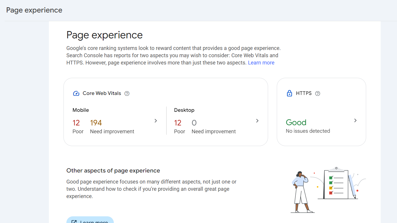
- Click on the Experience section
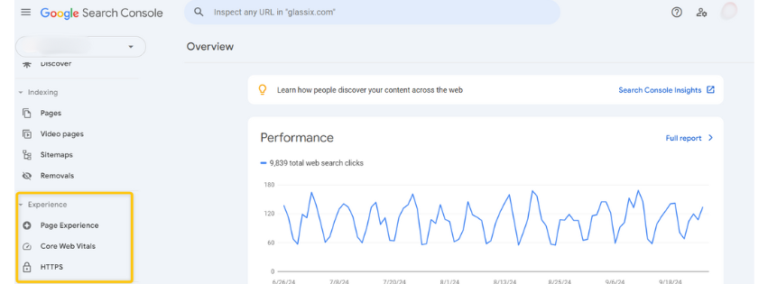
- In the “Page experience” tab, you can see your CWB on mobile and desktop, as well as your HTTPS. These numbers are a rough summary of how your web pages perform in terms of CWB and HTTPS.
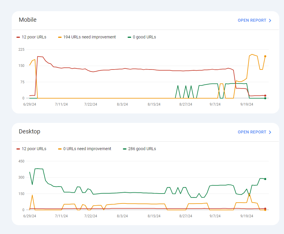
4. Click on the “Core Web Vitals” for a graph that shows page performance over time for both desktop and mobile.
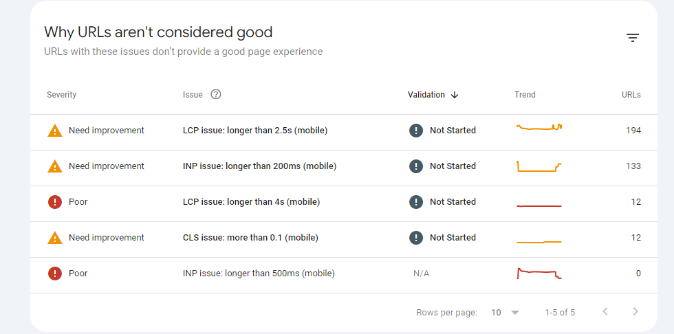
5. Go to “Open report” for more details on why some URLs aren’t considered good.
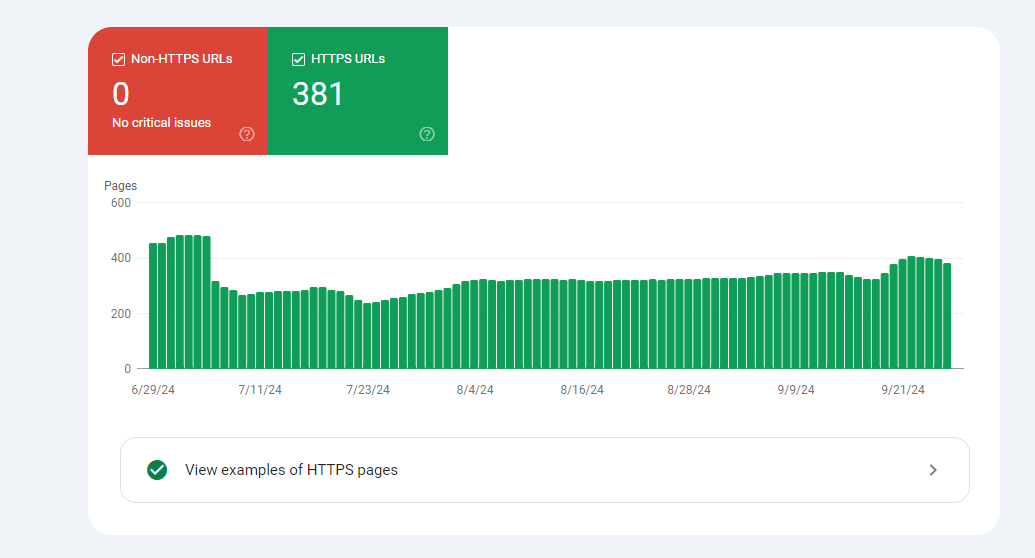
6. For more details on HTTPs, open the “HTTPS tab” and check if you have any critical issues.
It’s worth noting that while Google Search Console provides valuable insights, it doesn’t offer real-time or highly detailed data. For more in-depth analysis, you might want to consider using additional tools such as Page Speed Insights and Lighthouse.
Google Analytics 4
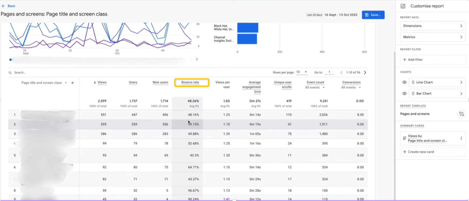
Low bounce rate and more pages viewed per session show that the user is engaging with the page. To check your conversions and bounce rate, follow these steps:
- Go to Reports>Customize reports>Metrics>Add metrics
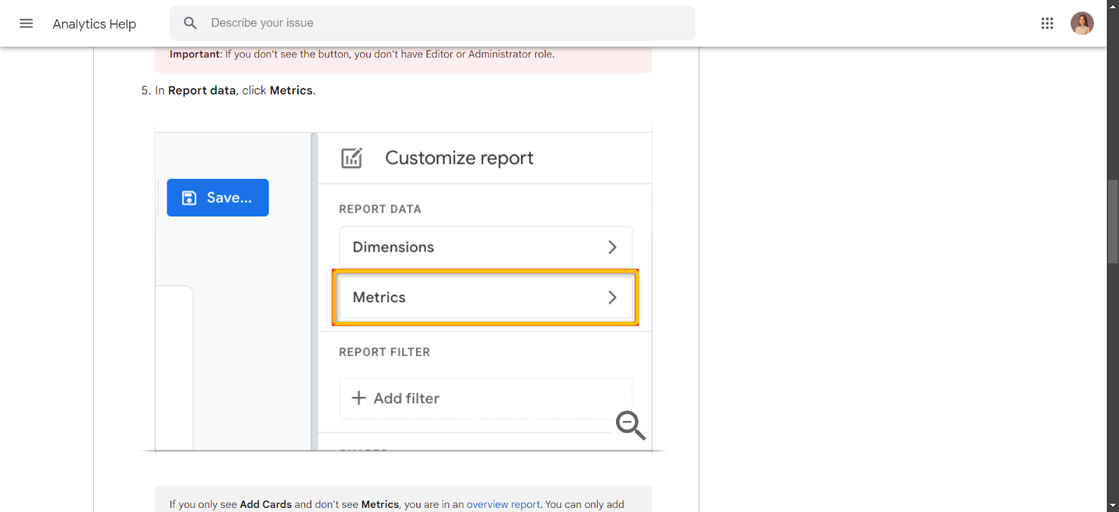
- Your bounce rates and conversion will appear in the main dashboard here
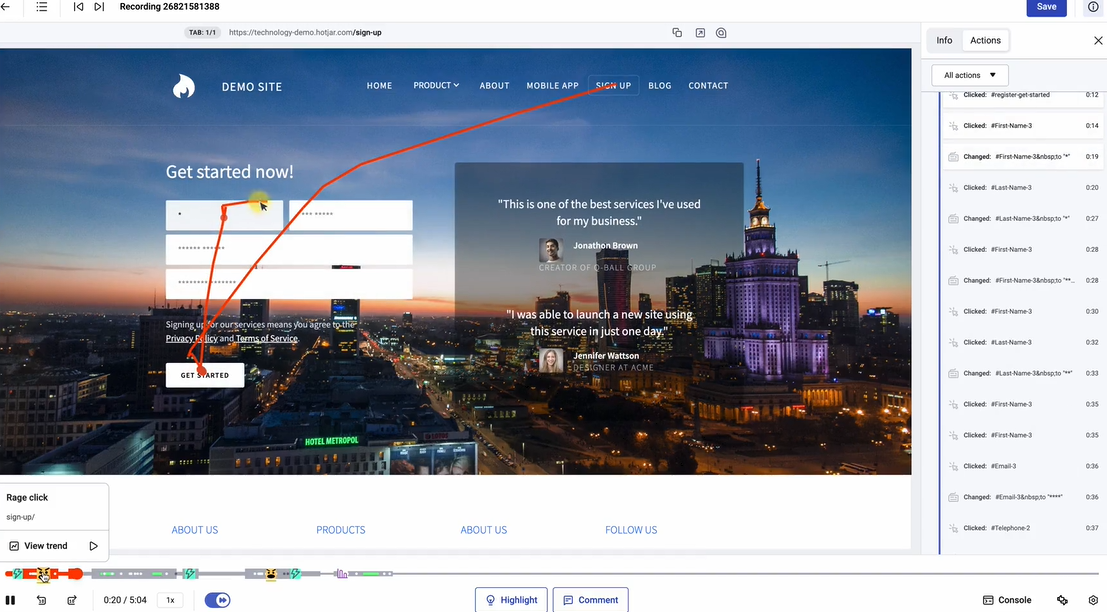
Heatmap tracking
A heatmap tracking tool tracks and records your users clicks, mouse movement and scrolls.
For the purpose of measuring UX, you can analyze with what elements your users interact with most and least. You can easily see if some buttons aren’t clickable, or users can’t easily find their way back to the page, etc.
For the purpose of heatmap tracking, you can use paid tools such as Hotjar. Once you set up your account, you can turn on the heatmap tracking by customizing the tracking date, type of heatmap, and other filter options.
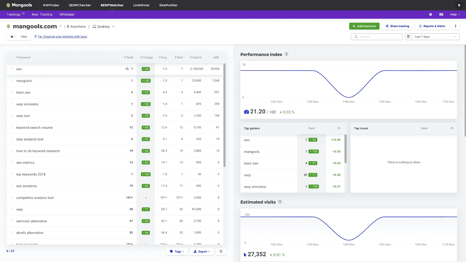
Mangools SERPWatcher
Besides our SEO extension for Page Speed analysis, we have the SERPWatcher to monitor your website rankings and fluctuations accurately after making UX changes to your website.
With this SEO tool, you can:
- Know the organic traffic potential of your website
- Get rank updates every day via email
- Track rankings in more than 50K locations
- Share interactive reports via a link
Frequently asked questions
Is UX an SEO ranking factor?
Yes, UX is considered a ranking factor, since poor user experience (high bounce and exit rates) signal to Google that the page didn’t meet user expectations, and can affect rankings. In fact, John Mueller himself said that speed (UX category) is definitely a ranking factor in 2019.
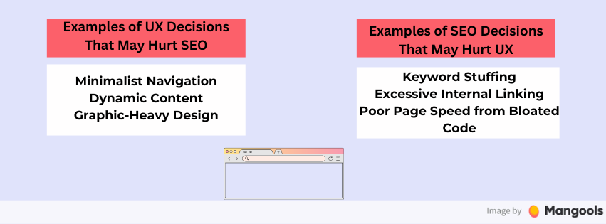
How to find the perfect balance between SEO and UX?
To find the perfect balance between SEO and UX, make sure to always put the user experience first. If the user’s expectations are met, Google will catch up. Overoptimized content may result into suboptimal user experience. Therefore, if you are thinking of adding infographics, changing fonts or navigation, make sure it benefits the readers.
How does SEO help user experience?
All SEO best practices show that the reader needs to easily find what they are searching for. If they find it quick and easy, users will be satisfied. Some On-page best practices such as clear headings, bullet points, and concise paragraphs, organizing content logically, etc ensure that the information they seek is easily skimmable and user-oriented.
What is SXO?
SXO (search engine experience optimization) is a term for combining SEO and UX principles to create webpages and websites that rank highly in relevant SERPs while providing a seamless user experience. To achieve this, website owners need to meet the search intent, create high-quality content, master technical optimization and polish their UX.
