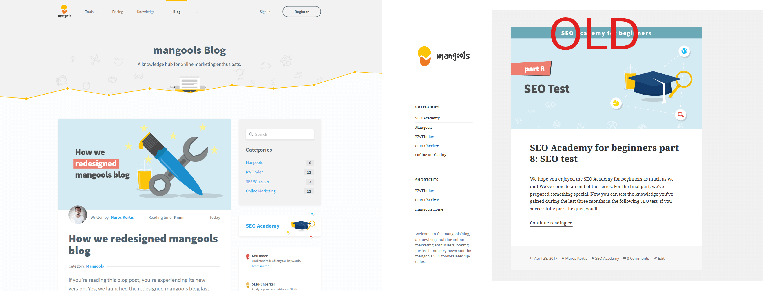
If you’re reading this blog post, you’re experiencing its new version. Yes, we launched the redesigned mangools blog last week!
The design may look familiar to you and that’s what we wanted to achieve. The structure hasn’t changed that much but the design tells you’re on of the mangools websites.
3 reasons why we redesigned our blog
1. Mangools design integration
We spent the last couple of months working on our design template. And it paid off. We’ve started with mangools.com where we showed the new design.
The new mangools site represents how we think.
Our main aim is to create user-friendly SEO tools with amazing design.
A couple of weeks ago we redesigned landing pages of our existing tools and created a new one for the upcoming rank tracking tool SERPWatcher. Right after, we updated the app versions of the tools.
The last site to redesign was our blog, a WordPress based site. It looked a bit different from other mangools sites so there was no doubt it’s going to be a major change.
2. Generic template design
The earlier version of the blog was one of the WordPress templates. We had only customized the necessary stuff. On the other hand, we liked the structure and simple design.
As you can see, we kept the two column design, though, we changed the sides. Besides the main blog categories, there are direct links to SEO Academy and our tools.
Navigation bar and header area are completely new – they’re mangools!
3. More interaction with readers
From time to time, the simplicity can affect user interaction in a negative way. We decided to add a few features that should lead to higher engagement of our readers.
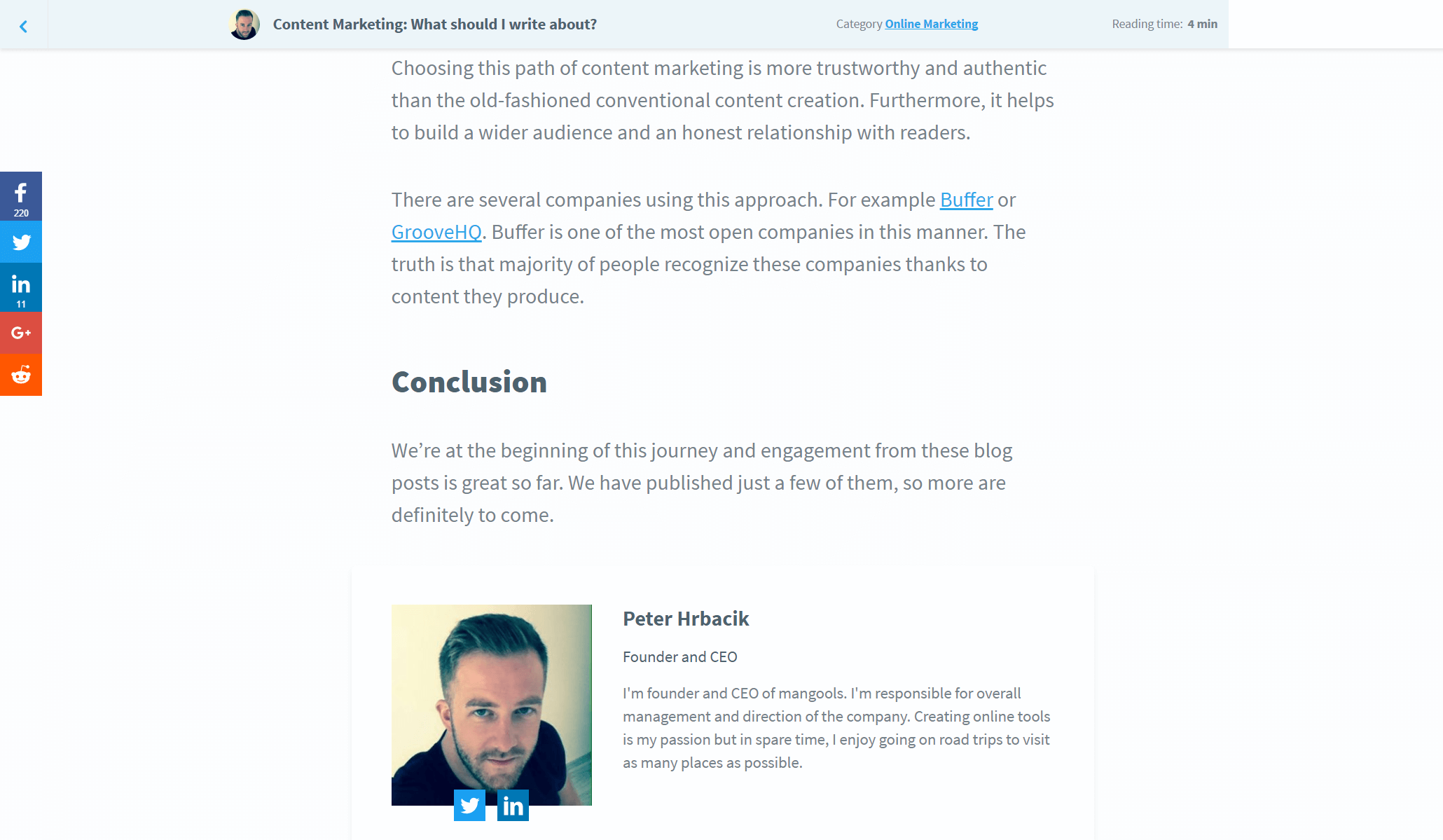
Let’s start from the top. A handy progress bar at the top of this article is loading right now as you keep reading. Just try to scroll and you’ll spot it. This way, you know how long is the blog post. Moreover, there’s an average reading time of each article.
Another feature we planned to implement is name, photo and short bio of the author. Here it is!
Goals of the redesigned mangools blog
1. Mangools design integration
We managed to redesign the blog in the mangools way. It’s clear for everyone visiting the blog as it shares the same design, UX and SEO values.
The logo, navigation bar, main banner area, fonts types and sizes, they’re identical.
2. Focus on content
When you’re reading, there are no disruptive factors. You can focus on the content.
The structure is simple: navbar, main image, content itself. Once you reach the end, you’ll find more related articles. Our aim is to ensure smooth reading flow so you don’t only read but enjoy the reading.
3. Readability
Updated font types, sizes and colors make the content easier to read. And good reading experience leads to higher engagement. We also centred the text area, so you don’t need to look at the right part of your desktop screen anymore.
Images are another very important element. They should be clear and stick to context. That’s why we started implementing unique images instead of using photo banks. It may happen you won’t see them on all posts as we’re still working on it.
4. Engagement
As we mentioned earlier, the reading time and real-time progress bar inform you how long it takes to read the post. Besides these, we relocated social share buttons. Now you can share articles before you reach the end. They’re on the left on desktop screens or on the bottom of mobile screens.
Would you like to interact with us or guest bloggers? We added a photo and short bio of each author so you can see who’s behind the content and get in touch with them via Twitter or Linkedin.
And one more thing! If you’re looking for specific content, you can use the search bar located in the categories panel.
5. UX and SEO
All previously mentioned points improve UX and that’s our number one goal. UX and SEO help each other, therefore, we think all the time how to improve both of them.
If you’re redesigning any part of your website you have to remember that it can affect your SEO. You must take the necessary precautions. Here is a useful article on how to prevent SEO disasters.
Our blog’s been running only for a few months and we have a long road ahead. Content, SEO and UX are the three main keywords on which we build it.
Is it working?
It’s too early to analyze the numbers. The redesigned Mangools blog is online from last Friday. We’ll see the results later. But what can we say now? We’re very delighted! It looks as we planned, follows our template and shares the same values as our other sites.
We’ll be checking the numbers and keep you updated!
Meanwhile, what do you think about the redesign? Feel free to share your thoughts in the comments below.


